Chart Builder
Chart Builder helps you create quick, embeddable Vega-Lite visualizations directly from your data.world datasets and queries. Whether you are illustrating trends, showcasing insights, or documenting discoveries, Chart Builder is a simple, powerful tool for turning raw data into meaningful visuals.
This integration is ideal for analysts, researchers, educators, or anyone who wants to communicate insights with clarity and speed—without complex setup or code.
Key benefits include:
Visual-first chart building: Create Vega-Lite visualizations through an intuitive UI—no need to write JSON by hand.
Use with files or queries: Start from tabular files or SQL/SPARQL query results to visualize exactly what matters.
Fine-tune in Vega-Lite editor: Switch to code view for full control over chart styling and behavior.
Share and collaborate: Post charts as project Insights, embed them in markdown comments, or download them for reuse.
Enabling Chart Builder integration
Before using Chart Builder, you need to enable the integration. You can do this from either the Integration gallery or directly from a dataset.
Enabling the integration from the Integration gallery
To enable the Chart Builder integration from the Integration gallery:
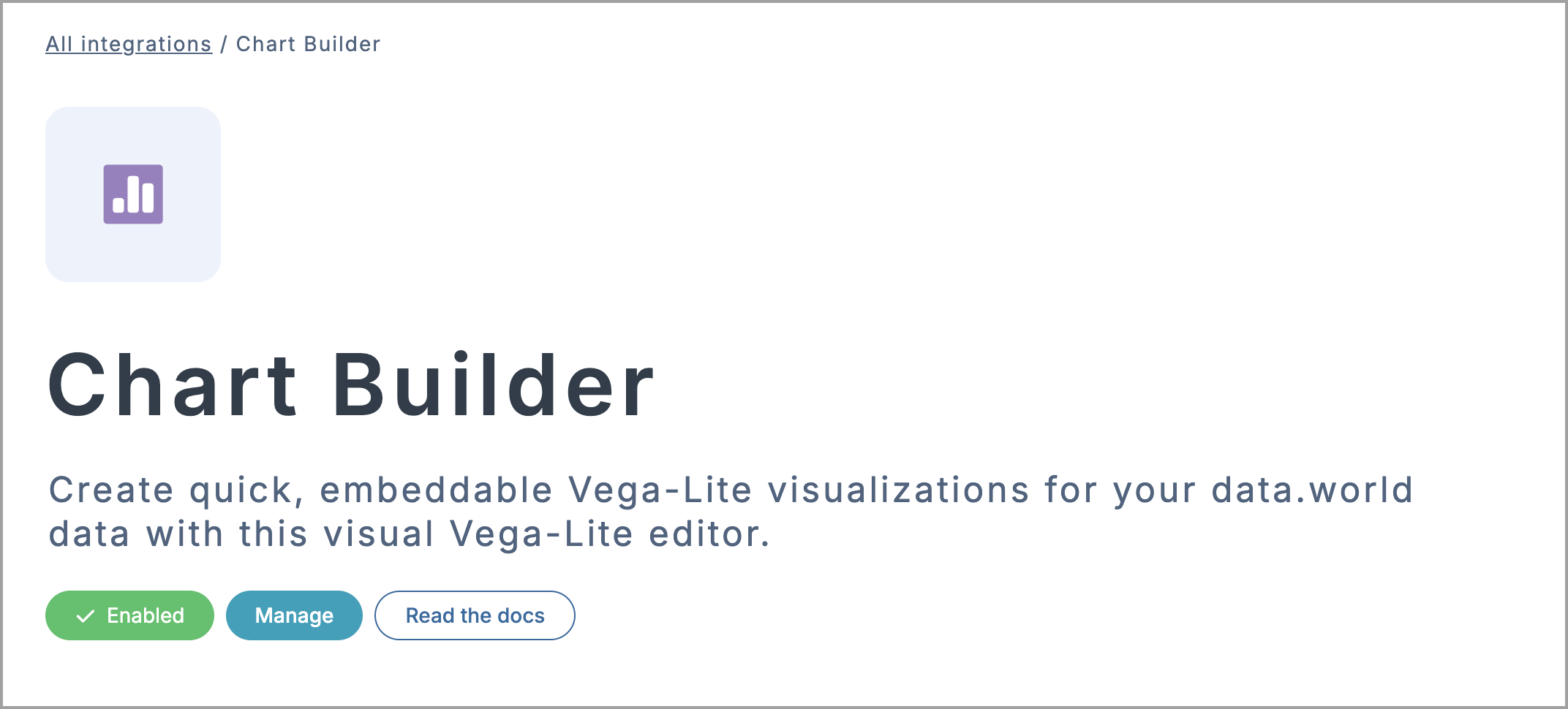
Go to the Chart Builder integration page on data.world.
Click Enable integration and review the requested permissions.
Click Authorize Chart Builder to confirm. Once authorized, the integration will be enabled for your account.
You can now launch Chart Builder directly from any dataset or project using the Open in app button.
Enabling the integration from a dataset
To enable Chart Builder integration from a dataset:
Open the dataset where you want to use the Chart Builder.
In the Files section, find your data source and click the Open in app icon.
In the Open in a third-party app window, click Explore more integrations.
From the list, select Chart Builder to open the integration page.
Click Enable integration > Authorize Chart Builder to complete setup. Once authorized, the integration will be enabled for your account.
Click Back to my dataset to return and begin using Chart Builder via the Open in app button.
Opening your data in Chart Builder
After enabling the integration, you can launch the Chart Builder from any file or query in your dataset or project.
To open data in Chart Builder:
Go to the dataset or project page on data.world.
For projects: Open the Project workspace, select the relevant file, and click the Open in app button > Chart Builder.
For datasets: In the Files section, locate your data source and click the Open in app icon > Chart Builder.
If prompted, choose the instance you want to use. If your team uses a different instance, click Another data.world instance? and enter your instance name.
Review the requested permissions and click Authorize Chart Builder to confirm. Chart Builder will open with your selected data loaded and ready to visualize.
Creating a visualization from connected data
Once your data is loaded, Chart Builder opens in Visual Builder mode by default. From here, you can build and preview charts interactively, or switch to the Vega-Lite Editor for advanced control.
To create a visualization:
In Chart Builder, in the Configuration section, select a field for the X and Y axes. The chart will render automatically based on your selections.
Use the Marks dropdown to choose the chart type — for example, Bar, Line, or Circle. Marks define how your data is represented visually—helping you highlight comparisons, distributions, or patterns.
In the Set chart size section, adjust the width and height of your chart to improve readability or match layout requirements.
Open the Options dropdown to set:
Type of data representation to define how values are interpreted.
Aggregate functions to summarize or group your data (count, sum, average, and more)
Apply sorting, scaling, or binning for cleaner structure and more meaningful comparisons
Click Add encoding to add more fields — useful for incorporating additional dimensions or refining how your data is displayed.
To rename your chart, click the Untitled chart label and enter a name.
Optionally, switch to the Vega-Lite Editor tab to customize your chart using JSON. This gives you full control over styling, layout, and behavior. For more details, see the Vega-Lite Editor guide.
Visualizing multiple columns in one chart
Chart Builder works best with clean, structured data—but what if you want to chart multiple fields at once? By default, each axis in Chart Builder accepts a single column, which limits the ability to compare multiple series side-by-side.
To solve this, you can reshape your data using the UNPIVOT technique in SQL. This transforms columns into row-based key-value pairs, making them easier to combine visually. Once your data is reshaped, Chart Builder can treat all values as part of the same series—perfect for comparisons and grouped views.
How to chart two related fields?
If your dataset includes two fields that represent the same kind of value—such as temperature_high and temperature_low—you may want to show both in one chart to highlight differences over time.
To visualize two related columns:
Start by running a simple query with the original fields, such as date, temperature_high, and temperature_low.
Open the results in Chart Builder and try visualizing temperature_low by date. You will notice there is no easy way to include temperature_high.
Go back to your query and rewrite it using UNPIVOT to combine the two fields into a single temperature column, with a second temp_type column to distinguish between high and low values.
Run the updated query. You should now have a table with date, temperature, and temp_type.
Click Open with Chart Builder to visualize the transformed data.
In the Visual Builder, configure your chart:
Marks: Circle
X Axis:date
Y Axis:temperature
Color: temp_type (to distinguish between high and low)
Explore two values over time in a clean, comparative chart—great for trend spotting.
How to chart multiple unrelated fields?
In some cases, you may want to compare entirely different categorical fields—such as Gender, Attack Type, and Fatality—in a single chart to explore relationships or distributions.
To visualize multiple unrelated fields:
Start by running a simple query with the original fields, such as year, type, Gender, and Fatality.
Open the results in Chart Builder and try visualizing the data:
Marks: Circle
X Axis:year
Y Axis:COUNT(*)
Color:Gender
You will notice there is no easy way to include attack type or Fatality data in the same chart.
Go back to your query and rewrite it using UNPIVOT to combine the fields as you need.
Run the updated query. You should now have a table with year, Value, and Type.
Click Open with Chart Builder to visualize the transformed data.
In the Visual Builder, configure your chart:
Marks: Circle
X Axis:year
Y Axis:COUNT(*)
Color:Type
Explore multiple fields in one view to compare patterns and understand how each value changes over time.
Sharing visualizations with your team
After building your chart, Chart Builder makes it easy to share or reuse your work — whether you are embedding it in project discussions, posting it to a file, or saving it as a team Insight.
To share your visualization:
In Chart Builder, in the upper-right corner, click Download or Share.
To save the chart to your device, click Download and choose a format:
JSON: Save the full chart specification for reuse or advanced editing later in Vega-Lite (.vl.json) or Vega (.vg.json) format.
Image: Export a static PNG or SVG image—ideal for presentations, slides, or including in reports.
HTML: Download a self-contained file you can embed anywhere that supports HTML.
To publish or reuse your chart in data.world, click Share and choose one of the following:
Insight: Add the chart to a project Insight. In the Save as insight window, choose the target project, enter a title and description, and click Save.
File: Upload the chart to a dataset or project workspace. In the Save as file window, select the destination, give it a filename, and click Save.
Markdown Embed (Comment): Embed your chart into comments, summaries, or insights. In the Share URL window, click Copy, then paste it anywhere Markdown is supported to display the chart.
Share URL: Get a direct link to this chart in Chart Builder. Use this to share a live-editable version with others for quick handoff or feedback.
Troubleshooting Chart Builder
Chart Builder may occasionally encounter issues when loading data or rendering charts—use the following steps to troubleshoot common problems.
Troubleshooting Error loading data message
If you see an Error loading data message when opening Chart Builder, your integration token may have expired.
To fix the Error loading data message:
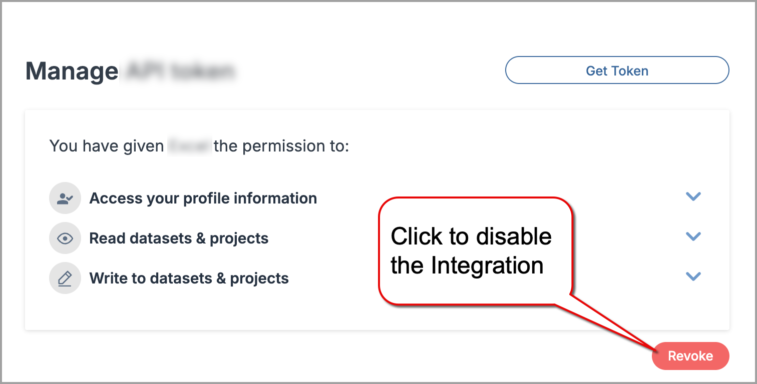
Go to the Chart Builder integration page on data.world.
Click the Manage button.
In the Manage permissions section, click Revoke to disconnect the integration.
Click Enable integration again and reauthorize access.
Return to your dataset and open Chart Builder—your data should now load correctly.
Troubleshooting blank chart after editing Vega-Lite
If your chart appears blank after editing in the Vega-Lite Editor, it is likely due to a syntax or config error in the JSON.
The Vega-Lite editor does not provide inline error messages—check for typos or structural issues manually, especially around encoding, data, and mark sections.
For reference, see Vega-Lite documentation for examples and valid schema structure.
Disabling the integration
Disabling the integration will revoke the application access to your data.world account, datasets and projects data.
Important
To use the integration again, you will need to reconnect and reauthorize access.
To disable an integration:
Go to the integration page.
On the integration page, click the Manage button.
In the Manage section, click Revoke and confirm disconnecting the integration.